Tableau integration enhances Tallyfy Analytics by offering extensive data visualization tools for creating interactive dashboards and reports to analyze workflow performance through direct connectivity with Amazon Athena.
Sample Tableau visualizations
This guide showcases Tableau visualization examples you can create using Tallyfy Analytics data. Each example addresses specific business questions and provides insights into your workflow performance.
- Identify Bottlenecks - Pinpoint where processes slow down
- Track Performance - Monitor individual and team productivity
- Recognize Patterns - Discover trends in workflow execution
- Measure Compliance - Track adherence to deadlines and requirements
- Optimize Resources - Ensure balanced workload distribution
This visualization shows the percentage of tasks completed on time versus late, helping you assess overall timeliness across your organization.
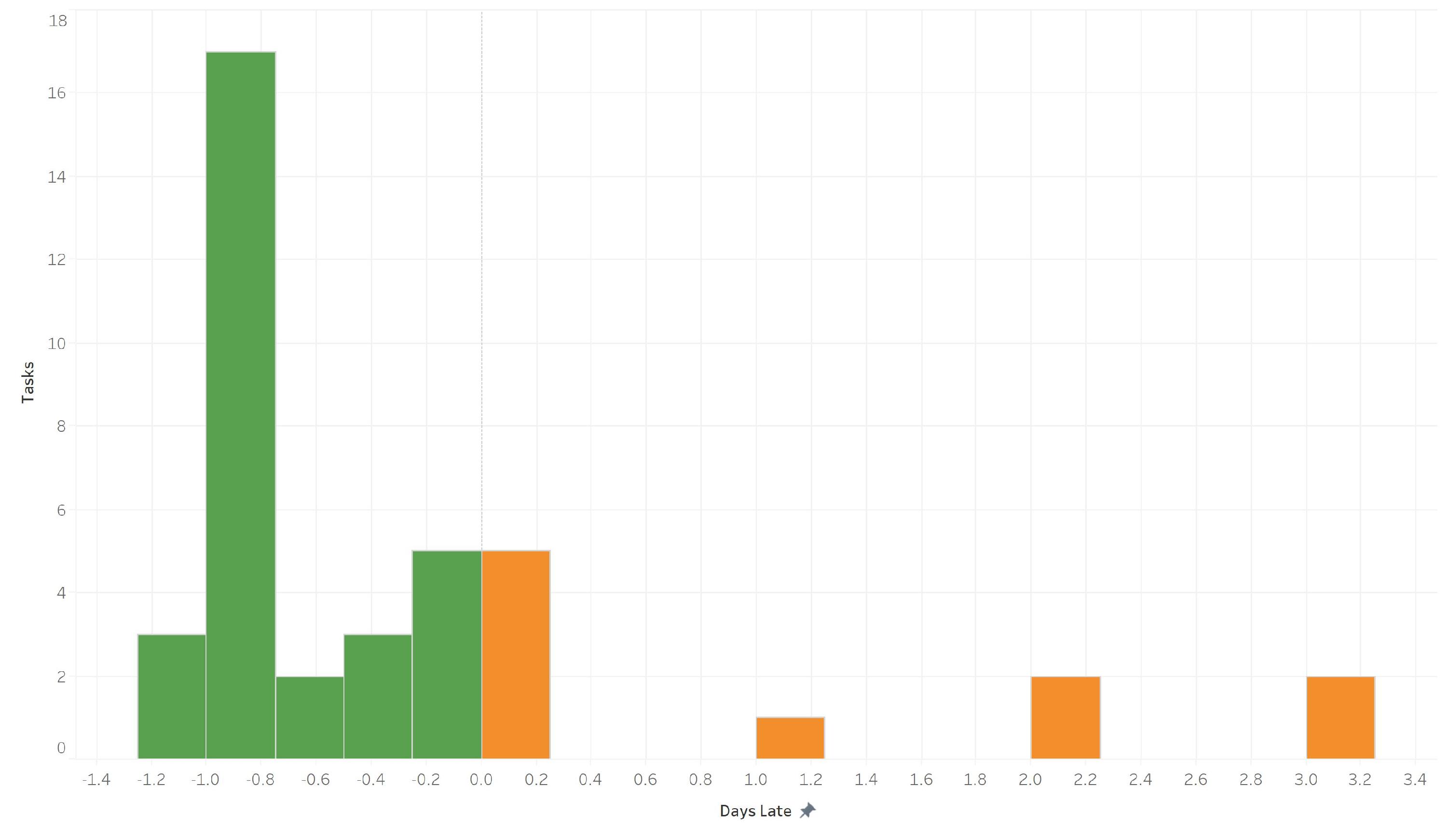
Business Questions Answered:
- What percentage of our tasks are completed on schedule?
- Is our organization meeting deadline expectations?
- Should we reconsider how we establish due dates?
Compare the on-time completion rates across different team members to identify users who consistently meet deadlines and those who may need additional support.
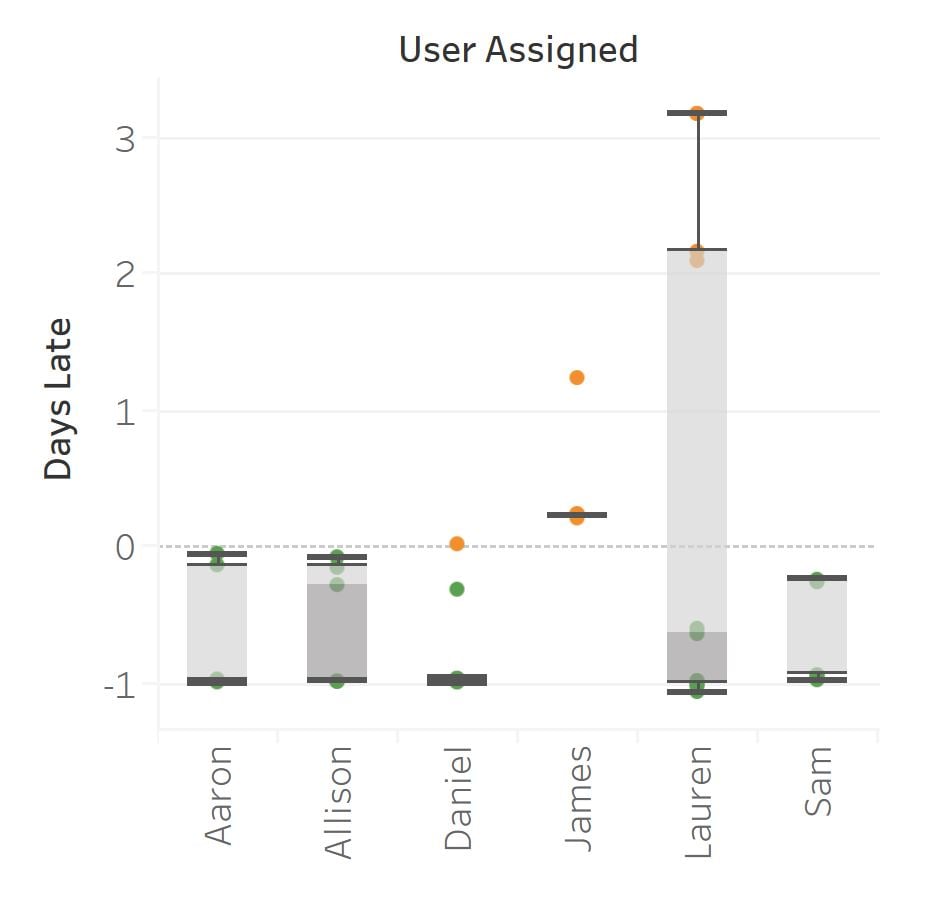
Business Questions Answered:
- Which team members consistently meet deadlines?
- Are there specific users who need assistance with time management?
- How do different departments compare in timeliness?
Track how on-time completion rates have changed over time to identify improvements or deteriorations in performance.
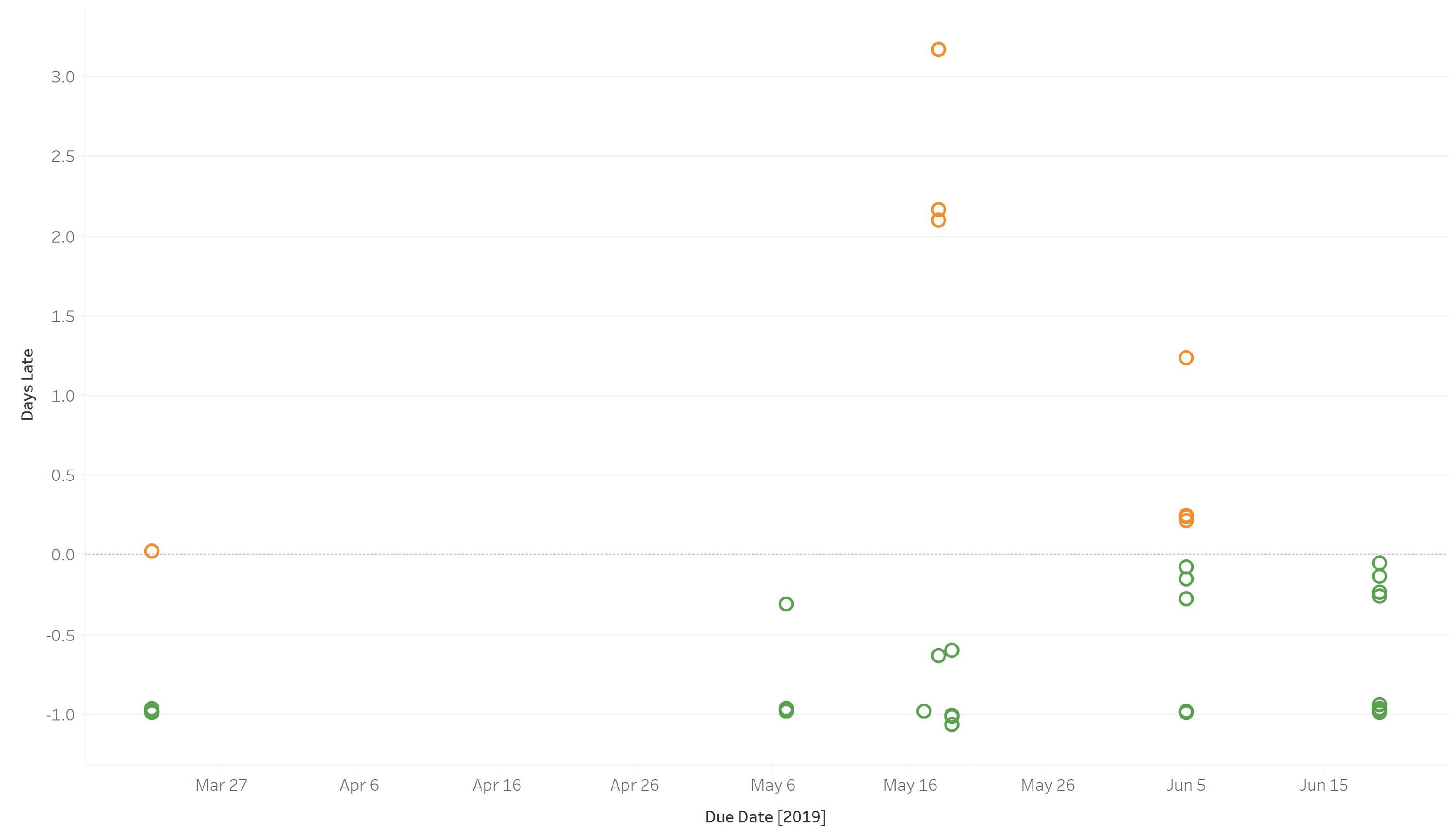
Business Questions Answered:
- Is our timeliness improving or declining?
- Were there specific periods when performance dropped?
- Have process changes impacted completion times?
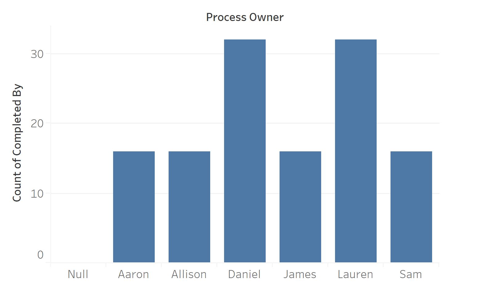
View how process ownership is distributed across your team to ensure balanced workloads and identify frequent users.
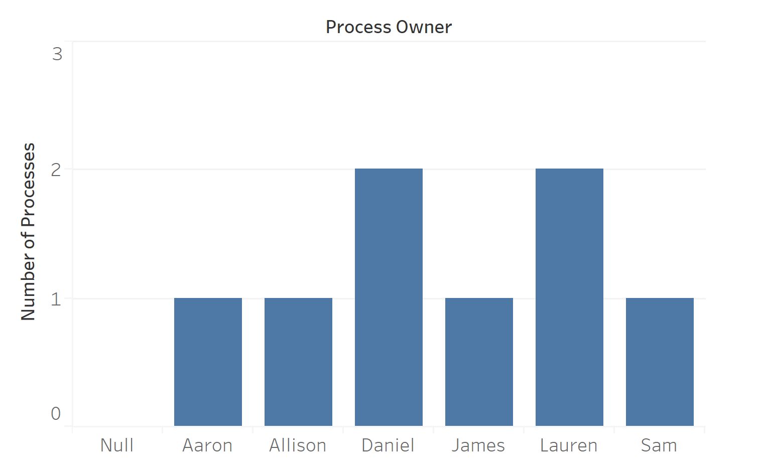
Business Questions Answered:
- Is process ownership evenly distributed?
- Are certain users handling a disproportionate amount of work?
- Which users are most engaged with the platform?
Analyze individual productivity by measuring completed tasks per user, helping identify users with high completion rates and capacity issues.
Business Questions Answered:
- Who are your most productive team members?
- Is the workload appropriately distributed?
- Are any users significantly above or below average completion rates?
Identify which specific tasks in your processes tend to be completed late, highlighting potential process design issues.
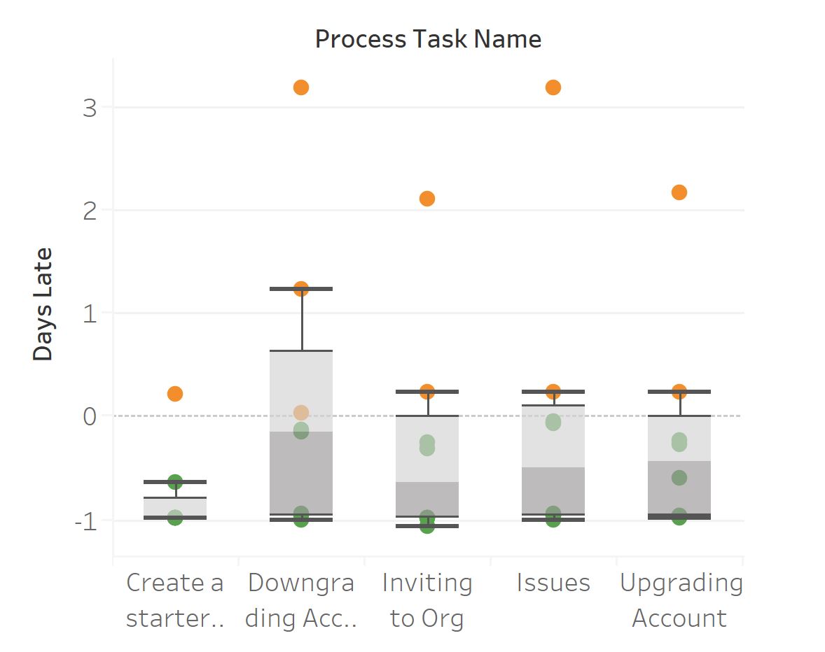
Business Questions Answered:
- Which tasks consistently cause delays?
- Are there specific steps that should be redesigned?
- Do certain task types have longer completion times?
Track which process templates are most frequently launched, helping identify popular and underutilized workflows.
Business Questions Answered:
- Which processes are most frequently used?
- Are there templates that should be retired or redesigned?
- How does template usage vary across departments?
Monitor work patterns by tracking task completions by day, revealing workload distribution and potential capacity issues.
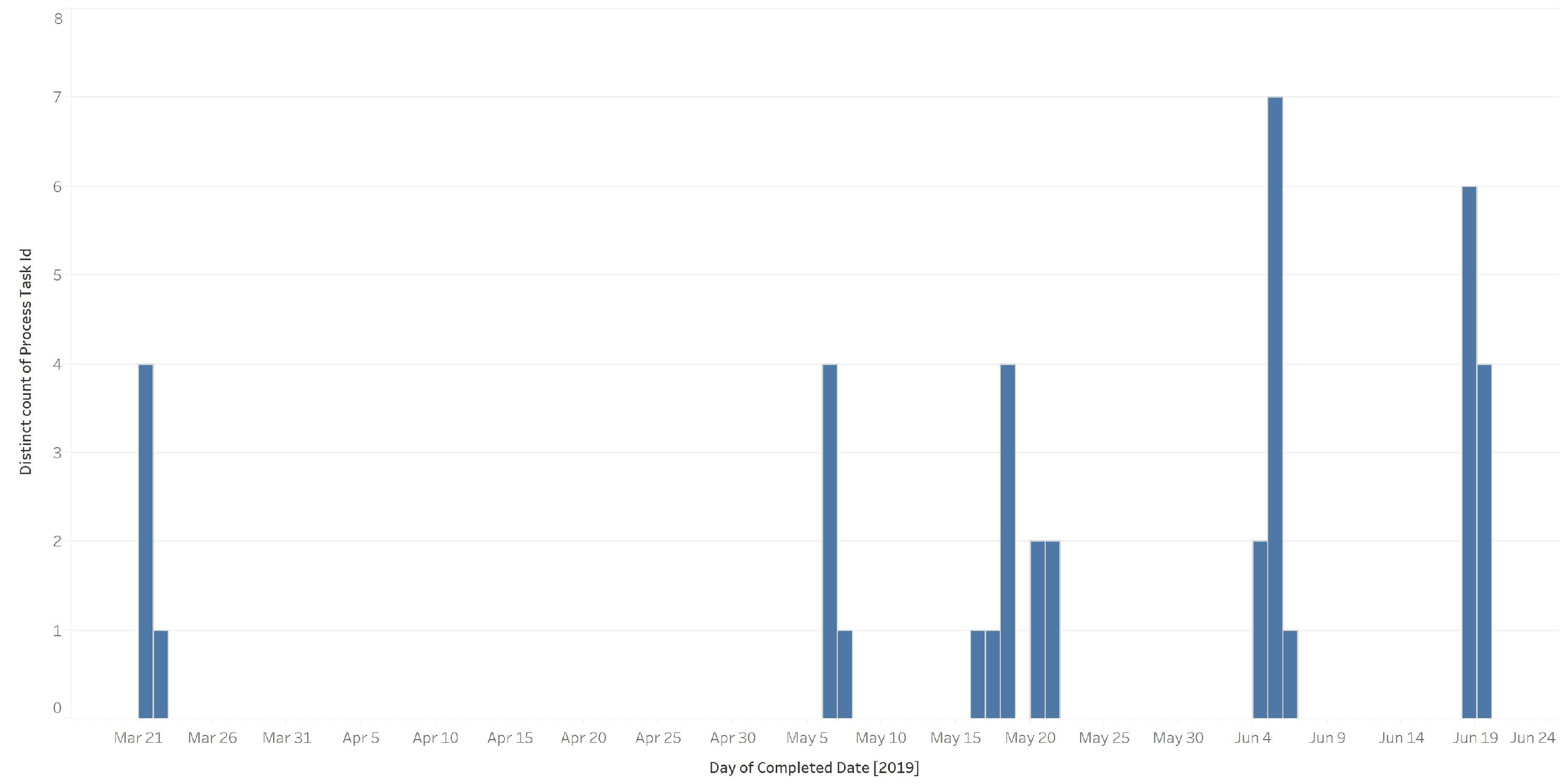
Business Questions Answered:
- Are there patterns in when work gets completed?
- Do we have consistent workflow or significant fluctuations?
- Are there days when productivity peaks or drops?
Identify which steps generate the most discussion, potentially indicating unclear instructions or complex tasks.
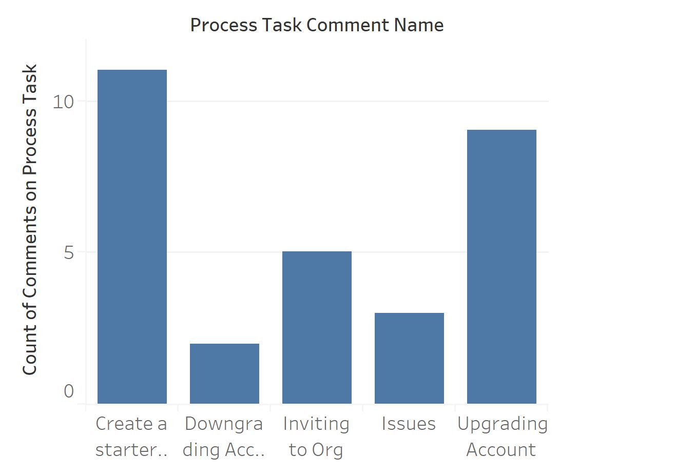
Business Questions Answered:
- Which tasks require the most clarification?
- Are there steps that need better documentation?
- Where is communication most intensive in our processes?
Highlight steps with the highest reported issues to prioritize process improvement efforts.
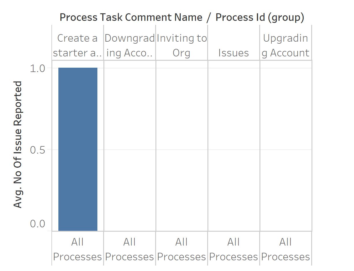
Business Questions Answered:
- Which tasks consistently generate problems?
- Where should we focus process improvement efforts?
- Are specific users experiencing more issues than others?
You can download and adapt our sample Tableau workbook to begin your analytics implementation:
- Download the sample Tableau workbook ↗
- Open the workbook in Tableau Desktop
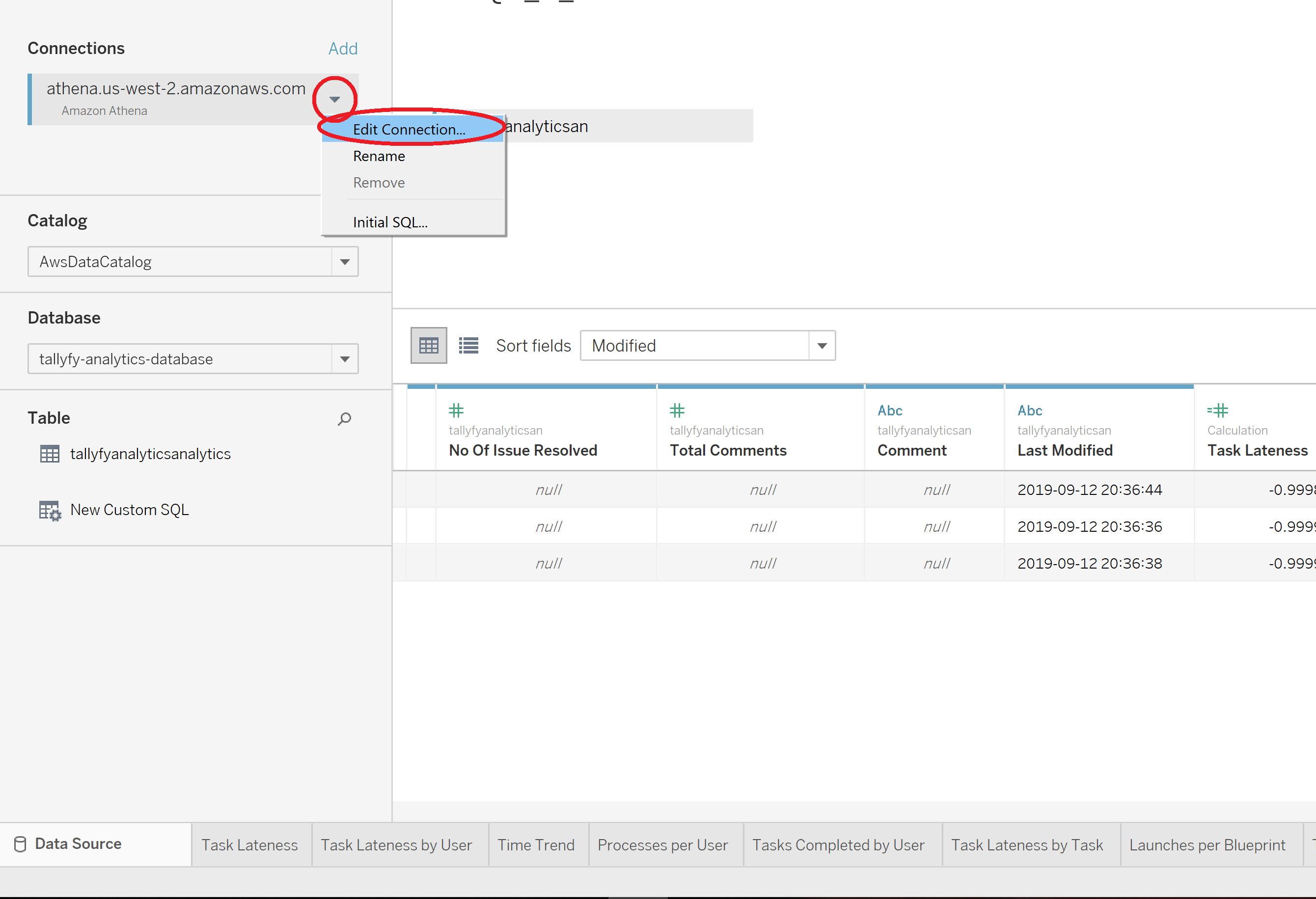
- Choose Edit Connection to connect to your Tallyfy data source
- Customize the visualizations to match your specific needs
These examples represent just a starting point. With Tallyfy Analytics data and Tableau, you can create custom visualizations tailored to your organization’s specific workflow questions and KPIs.
Process Improvement > Gathering data and using Tallyfy analytics for insights
Data-driven process improvement relies on objective metrics and analytics tools like Tallyfy to identify bottlenecks measure performance and guide optimization efforts for enhanced operational efficiency.
Process Improvement > Understanding process flow without complex flowcharts
Process flow visualization and management is simplified through sequential steps activities and handoffs that help identify bottlenecks inefficiencies delays and areas for improvement while transforming inputs into valuable customer outputs.
Tableau > Connect Tableau to Tallyfy
A comprehensive walkthrough for establishing a connection between Tableau and Tallyfy Analytics via Amazon Athena by installing required drivers setting up authentication and configuring data tables for workflow visualization and reporting.
About Tallyfy
- 2025 Tallyfy, Inc.
- Privacy Policy
- Terms of Use
- Report Issue
- Trademarks